Skip to content
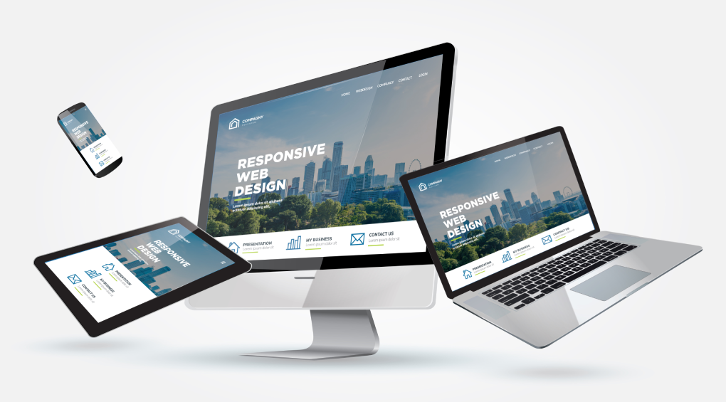
In today’s digital world, your website is more than just an online presence—it’s the core of your brand identity. With users accessing the web from desktops, laptops, tablets, and smartphones, adaptability has become a non-negotiable requirement. Responsive web design ensures that your website adjusts fluidly across all devices, maintaining a professional and user-friendly brand while enhancing SEO rankings.
Search engines like Google place significant importance on user experience. If a visitor lands on your website and struggles with readability, navigation, or loading speed, they’re likely to leave quickly. This negative behavior signals to search engines that your site isn’t meeting user needs, lowering your rankings.
Responsive design addresses these challenges by delivering a smooth, user-centered experience. It eliminates the need for separate mobile and desktop websites, reducing redundancy and maintenance costs. More importantly, it positions your brand for higher visibility, stronger engagement, and lasting search engine success.
Mobile-First Indexing: A Game-Changer for SEO
Google’s mobile-first indexing now transforms the way people evaluate websites. Instead of reviewing desktop versions first, search engines now prioritize the mobile version of a site. If you fail to optimize your website for mobile devices, your rankings will suffer, regardless of the quality of your content.
Responsive design ensures your website automatically adapts to smaller screens. It guarantees visitors on smartphones and tablets receive the same seamless experience as those browsing on larger devices. By prioritizing mobile usability, you meet Google’s requirements while increasing your chances of ranking higher.
For businesses, this change makes mobile optimization essential. Responsive design is a basic requirement for staying relevant. Adapting ensures your business stays current with algorithm updates and maintains optimal search visibility.
Enhanced User Experience Improves SEO Signals
Search engines analyze user behavior to determine whether a site deserves high rankings. Factors like time spent on site, bounce rate, and interactions with content all send signals about quality. A responsive web design keeps visitors engaged longer, which tells Google your website is valuable and relevant.
When users can easily read text, navigate menus, and interact with features, they’re more inclined to explore. They’re not frustrated by constant zooming or sideways scrolling, which reduces abandonment. Instead, they experience your brand positively and may even return for future visits.
This enhanced user experience creates a win-win situation. Visitors enjoy browsing, while search engines reward you with improved rankings. By focusing on responsiveness, you build a site that performs well for both humans and algorithms.
Faster Loading Speeds Drive Higher Rankings
Page speed is one of the most critical factors in SEO performance. Studies show that users abandon websites if they take longer than three seconds to load. Responsive design cuts loading delays by optimizing images, code, and layouts for all devices.
It utilizes fluid grids, flexible visuals, and streamlined CSS to load content quickly without requiring extra resizing or redirects, resulting in a smoother experience that keeps visitors engaged.
Search engines favor fast-loading sites because they serve users efficiently. Responsive design meets Google’s speed standards and user expectations. Faster sites rank higher and retain customers longer.
Lower Bounce Rates Mean Better SEO Results
A high bounce rate can hurt your SEO performance. If visitors land on your site but leave right away due to poor usability, search engines assume your content lacks relevance. That impact lowers your visibility and reduces your chances of ranking well.
Responsive design addresses this issue by creating a consistent and welcoming environment across devices. Visitors can read content, navigate menus, and complete actions without hassle. As a result, they’re more likely to stay longer and explore multiple pages.
Lower bounce rates strengthen SEO signals and boost conversions. When users have a smooth experience, they trust your brand and return. A responsive website keeps visitors engaged, reducing bounces and improving rankings at the same time.
Improved Local SEO for Mobile Users
Local SEO is essential for businesses that rely on nearby customers. Most users searching for local services or products do so on their smartphones. If your website isn’t mobile-friendly, you risk losing this valuable traffic to competitors.
Google rewards mobile-optimized sites with higher placement in local search results. That factor holds particular importance for “near me” searches, where customers expect instant access to directions, hours, or services.
A responsive website ensures that your information is easy to find and navigate on the go.
For small and medium businesses, responsiveness drives local customer engagement. Whether you run a café, salon, or consultancy, a mobile-friendly site keeps you connected with your community. Responsive design boosts visibility and converts local searches into business opportunities.
Cost-Effective SEO Strategy
Managing separate desktop and mobile sites increases costs and effort. Each needs its own SEO, updates, and maintenance. Responsive web design solves this by combining everything into one adaptive site.
This approach simplifies optimization, saving time and resources. Keywords, backlinks, and updates are consistent across all devices. With one site to manage, you can focus on content and visibility instead of multiple platforms.
From an ROI perspective, responsive design is more efficient. It lowers long-term costs and improves results. One flexible, future-ready site creates a cost-effective SEO strategy that delivers ongoing value.
Social Media Integration and SEO Boosts
Social media traffic plays a big role in expanding your online reach. Many users discover businesses on platforms like Facebook, Instagram, or LinkedIn and then click through to their websites on mobile. If your site isn’t responsive, these visitors may leave instantly, weakening your social-driven traffic.
Responsive web design give social media visitors the same smooth experience as organic search users. Shareable content, mobile-friendly visuals, and clear navigation drive engagement. The easier it is to interact with your site, the more likely visitors are to share your content.
Social signals do not directly impact rankings, but they boost visibility and credibility. Responsive design captures the full value of social traffic, creating engagement that supports SEO. Aligning your site with social platforms strengthens your marketing reach.
How Responsive Design Improves Conversion Rates
Getting visitors to your site is one challenge; converting them into customers is another. A responsive design enhances conversions by making it easier for users to complete key actions, such as signing up, booking services, or purchasing products. Without barriers like distorted layouts or hidden buttons, users can take action smoothly.
Studies reveal that mobile-friendly sites achieve higher conversion rates than non-optimized ones. Clear calls-to-action, mobile-ready forms, and smooth checkout processes keep visitors on the path. Each responsive feature makes conversions easier.
Higher conversions drive measurable business growth. SEO traffic turns into loyal customers who generate revenue. A responsive site not only attracts visitors but also encourages them to act.
The Competitive Advantage of Responsive Web Design
In competitive markets, a responsive web design can decide whether you gain or lose customers. Many businesses utilize outdated designs that frustrate visitors and negatively impact their search engine rankings. A modern, device-friendly site immediately sets your brand apart.
Customers notice when convenience is a priority. A smooth and accessible website shows professionalism and reliability, building trust with potential clients. These impressions lead to stronger loyalty and more referrals.
From an SEO standpoint, responsive web design gives you an advantage. It captures traffic competitors miss and strengthens your position. Responsiveness goes beyond design—it provides a strategic edge in a crowded digital space.
Future-Proofing Your Business Online
Technology changes constantly, and websites that do not adapt fall behind. Responsive design protects your business by supporting a wide range of new devices and screen sizes. Flexible sites stay relevant without costly redesigns.
As platforms and algorithms change, a responsive website adjusts smoothly. Long-term adaptability protects your investment and ensures consistent user experiences. A responsive approach shows your business is forward-looking and customer-focused.
Future-proofing means leading change. Responsive design positions your brand ahead of trends, strengthens SEO rankings, and builds user trust. It keeps your business visible, adaptable, and competitive in a shifting digital environment.
Conclusion: The SEO Advantage of Responsive Design
Responsive web design delivers measurable results across every aspect of SEO. From mobile-first indexing and faster load times to stronger conversions and local visibility, its benefits go far beyond aesthetics. Search engines reward businesses that embrace responsiveness with higher rankings, better engagement, and sustained growth.
Failing to adopt responsive web design means falling behind competitors. In an era where mobile users dominate, outdated websites lose traffic, customers, and credibility. By prioritizing responsiveness, you strengthen your digital presence and safeguard your future success.
The message is clear: responsive web design isn’t optional—it’s essential. If you’re ready to boost your rankings, attract more customers, and gain a competitive edge, now is the time to act. Partner with Black Box Consulting experts and watch your SEO performance transform into lasting business results.